In a social media management panel you return to the same screens dozens of times a day. So the interface first has to be easy on the eyes, quick to search and clear about the numbers. DealerBot's new interface was redesigned around that idea.
This article covers what the new interface brings: calm surfaces, an optional dark theme, a command palette, the Dee assistant and a theme derived from your organization's identity. The interface is rolling out to organizations gradually, and we clarify at the end what that means.
Calm surfaces and data-first tables
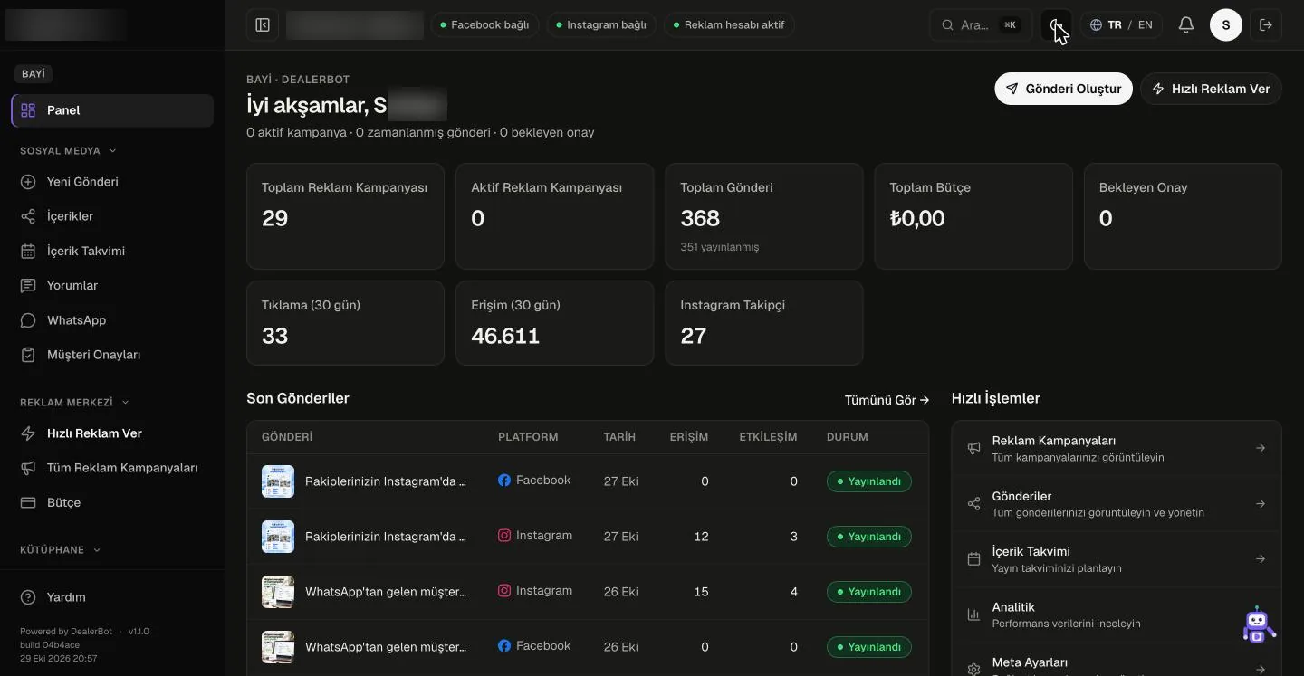
The new design reduces decorative elements and unnecessary color. Whatever the page is mainly for is what stands out. On headquarters and administrator pages this means a table-first layout: lists sit at the center of the screen with their own headings, filters and sorting; when you need detail, you pick a row and the context panel on the right summarizes it. On wide screens the panel stays at the side, on narrow screens it drops below the table.
Calm surfaces make dense lists easier to scan. Because digits are set at equal width in table cells, columns read cleanly one under another, and your eye works less hard moving from row to row in a list of hundreds of dealers.
Honesty about numbers is part of the same approach. A value that has not been measured yet is not shown as zero; it is marked with a dash. When a list fails to load, it does not say "no records" either; errors and empty states are shown separately. So when you read a report, you can tell whether a zero is really zero or just missing data.
The status strip at the top of the page collects items that need attention, such as connection and ad account health, in a single line. It raises no warning for something that has not been measured; it appears only when a real problem is known.
- Less decoration, more readable tables
- A right-hand context panel that opens when you select a row
- Unmeasured values appear as a dash and are never presented as zero
- Errors and empty lists are separate states
Dark theme, command palette and Dee
The dark theme is optional. It is offered as a choice that is easier on the eyes in long sessions or dim rooms, and it is saved as a user preference. In the dark theme the colors are tuned and measured separately, so text stays readable in both themes.
The command palette is the quick way to jump to a page without browsing the menu. It opens from the keyboard, pages are filtered as you type, and you go straight to the one you choose. For teams working with many dealers, this is often shorter than going several levels down the side menu.
Dee is the AI assistant inside the panel. You can ask how to use DealerBot and where a feature sits in the menu. Dee's limit is clear: it cannot access the live data in your account and it can make mistakes. For a critical number, you should check the report itself.
- Dark and light themes, saved as a user preference
- A keyboard-driven command palette that filters as you type
- Dee: an AI assistant for usage questions, with no access to live data
A theme derived from your organization's identity
In the new interface, the accent color comes from each organization's corporate identity. Once the primary color, logo and font are defined, buttons, links, the selected menu item and chart colors are derived from that identity. If nothing is defined, the default DealerBot color is used.
Think of a navy automotive brand. Buttons and the selected menu item derive from shades of navy, the side menu shows the brand's light-colored logo, and text keeps enough contrast against the background. For an agency that works in monochrome, the theme stays in shades of black and white; when the dark theme is switched on, the accent color is inverted to stay readable.
Color derivation takes readability into account: white or black text on a button is chosen automatically against the background, and sufficient contrast is required. A very light or very dark brand color therefore does not end up as an unreadable button. The theme is set from the brand editor in the administrator panel, and no technical step is needed to change it.
When an organization's identity is visible on screen, teams that work with several organizations can tell at a glance which one they are in. In sessions shown to a client or a dealer, a panel that looks like that organization also makes the presentation more consistent.
- Accent color, logo and font come from the organization's identity
- Button and menu text are chosen automatically against the background
- Set from the brand editor and reversible
What the gradual rollout means
The new interface is running in a pilot organization and is opening to other organizations gradually. The rollout works per organization: when an organization's accounts move to the new interface, everyone in that organization sees the same one, while other organizations keep working with the current interface for now. The client approval portal also works in the new interface.
This approach lets teams make the switch without changing their habits overnight. We can talk through where your organization stands and how the move can be planned during a demo call. During the move, the command palette and Dee also help teams get used to the new layout.
To see the new interface in your own organization's colors, request a demo. For an overview of the product, take a look at our home page (/en).
- Gradual rollout per organization
- Other organizations keep using the current interface in the meantime
- The client approval portal also works in the new interface